- Diese Seite auf Deutsch mit Plots für die deutschen Bundesländer
- Source code
- Further links
- the plots are inspired by the very similar analysis by my colleague J. Polzehl, partially based on different data sources and including plots for the US states
- a mathematical analysis by my colleagues M. Kantner and Th. Koprucki on possible strategies during the opening period
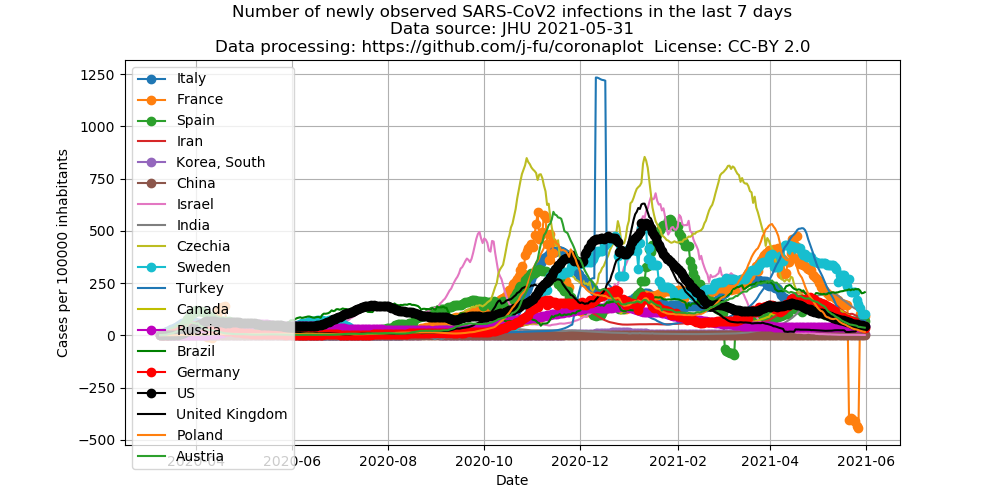
Number of new infections during the previous 7 Tagen per 100000 inhabitants

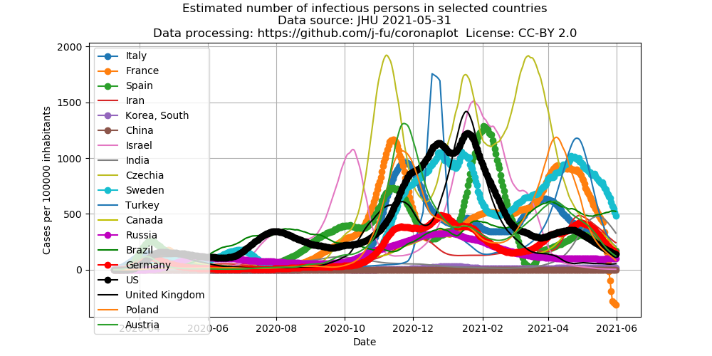
Estimate of the number of infectious persons

Here we try a conservative estimate of the number of infectious persons. We assume that an infected person is infectious on average 15 days. In order to remove daily fluctuations, the calculations are bases on a 7 day moving average of the number of infected people.
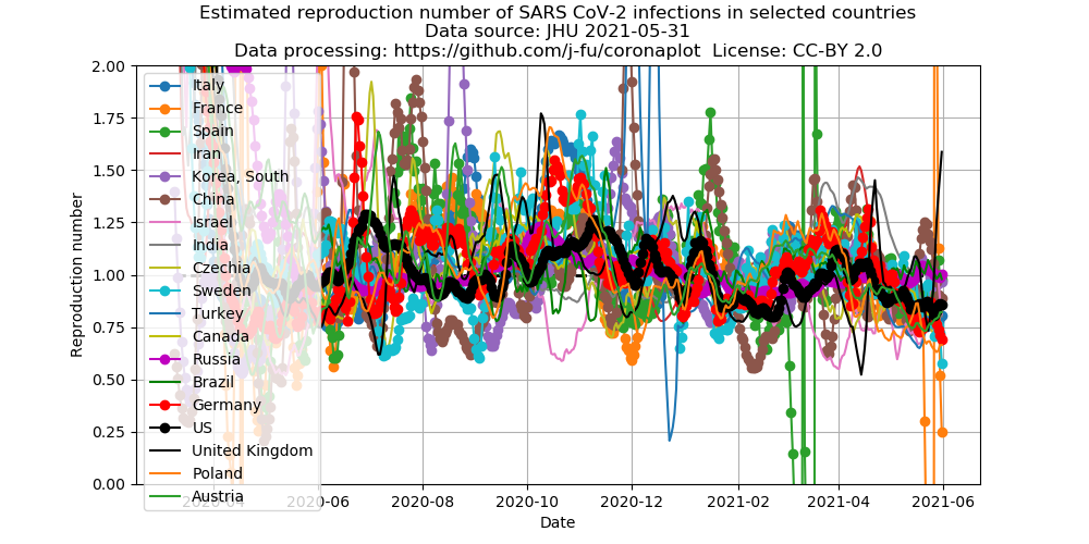
Estimate of the reproduction numbers
The German Robert Koch Institute (RKI) uses estimates the reproduction number based on a method e.g. described here. Here, we use the same method, howver based on the 7 day moving average of the number of infected people instead of RKI’s “nowcast”.

Number of dead per 100000 inhabitants

Changes
2020-11-16
- New layout with more space for graphs
- Additonal interactive graphs via Plotly.jl
- Plots of numebers of corona deaths
We document here significant changes besides data updates.
2020-05-06
- We plot different data now. The last “old” plots are here:


2020-04-13
- Growth rate plot now uses doubling time as primary data, y-axes have been switched
2020-04-03
- Additional plots for Germany
2020-03-29
- Additional data for Germany from the Robert Koch Institute (RKI). These are not published as time series.
These data are watched by Wikipedia, and time series
are provided in the article. These data are used here.
2020-03-24
- For the international data used here, there is now one US entry in the new format time series files which appearantly has been cleaned for the past. Counting seems to have changed. See also the annoucement by JHU.
2020-03-22
- Added 7-day average plot
- Switched averaging in the growth rate graph from arithmetic mean to geometric mean of the growth factors.
For varying daily growh factors over the averaging period, the geometric mean tells us what would have been the constant daily growth factor with the same outcome. Therefore, this type of mean is more adequate for this process. In comparison, before, in particular the US data had been biased by outliers. For comparison, here is the old graph with the data of March 22:
